Email editor settings
Everything you can change in the right panel of the email template editor, setting by setting. The panel changes depending on what you have selected on the canvas:
| If you select… | The panel shows |
|---|---|
| Nothing (click the gray background) | The email: what applies to the whole email. |
| The edge or background of a section | The section. |
| An empty spot in a column | The column. |
| A block | That block: heading, text, image, button… |
At the top of the panel you always see what you have selected and where it is: Section · section 3 of 10, Text · block 3 of 4. If it says Email · Tap a block to edit it, you have nothing selected.
How the controls work
The same six controls repeat throughout the panel. If you understand these, you understand everything:
| Control | What it looks like | How to use it |
|---|---|---|
| Option buttons | A row of buttons; the selected one turns mint green. | Click the option you want. Only one can be selected. Example: Left · Center · Right. |
| Number | A box with a number and the unit next to it (px or %). | Type the number or use the little arrows. If you type something out of range (for example 9999), when you leave the box it snaps to the maximum or minimum allowed. |
| Color | A little color square and a code like #23FFCF. | Click the square to pick the color with the picker, or type the code if you already know it (for example, your brand's). The ✕ removes the element's own color: it goes back to taking the email's. |
| Spacing | Four boxes: Top, Right, Bottom, Left. | Each box is the space on that side, in px. To leave room only above and below, set for example 20 · 0 · 20 · 0. |
| Switch | A sliding button. | Green is on; gray, off. |
| Advanced | A group with a little ▸ arrow, closed at first. | Click the title to open it. That is where the settings you almost never need live. |
The «reset» button
When you select a block, reset appears at the top right of the panel. Puts the style back to how it starts, leaving the content alone: the text you wrote, the image or the link stay; the colors, sizes and spacing go back to those of a new block. Useful when you have tweaked so much you no longer know how to get back. (And if you change your mind: Undo.)
«px» and «%»
px (pixels) is a fixed measurement: 20 px is 20 px on any screen. % is a share of the available space: 50% is half the column, whether it is big or small. For reference, the whole email is 600 or 700 px wide and normal text is between 14 and 16 px tall.
The email
What you see when you have nothing selected. These are the general settings: whatever you set here applies to the whole email, unless a section or a block says otherwise.
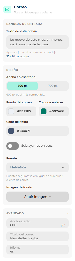
Inbox
| Setting | What it does |
|---|---|
| Preview text | The gray line shown next to the subject in the inbox, before the email is opened (Shown next to the subject in the inbox.). Use it to complete the subject, not to repeat it. Example: subject Your test drive is confirmed, preview We'll see you Saturday at 10 at the north branch. The counter (55 / 90 characters) turns yellow past 90: you can write more, but most inboxes cut it off there. |
Design
| Setting | What it does | Value for a new email |
|---|---|---|
| Desktop width | How wide the email is on a computer: 600 px or 700 px. 600 px is the most compatible. On a phone it always fits the phone's width. | 700 px |
| Email background | The color of the whole background, including the sides of the email on wide screens. Each section can have its own background on top. | White #FFFFFF |
| Link color | The color of linked words inside texts. Buttons have their own color. | Blue #0000EE |
| Text colour | The color of every text and heading that does not have its own. Changing it here is the quick way to change them all at once. | Black #000000 |
| Underline links | On, links are underlined. Off, they are only told apart by their color. | On |
| Font | The typeface for the whole email: Helvetica, Arial, Georgia, Times New Roman, Courier New, Verdana or Tahoma. Email-safe fonts: they look the same in every email client. | Helvetica |
| Background image | An image behind the whole email. You pick it with Upload image +; you remove it with the ✕ on the thumbnail. With an image set, three options appear for how to fit it (see below). | No image |
If the text color and the background color are too similar, a yellow warning appears: With these colours the text cannot be read. Change the text or the background colour. Nothing stops working, but the sent email would look just as unreadable.
How a background image is fitted (the same in the email and in sections):
| Option | What it does | When |
|---|---|---|
| Cover | Enlarges the image until it covers the whole space. It may crop the edges of the image. | Hero photos. Almost always this one. |
| Contain | Shows the whole image, without cropping anything. It may leave empty strips on the sides. | When no part of the image can be lost. |
| Repeat | Repeats it like tiles, one next to the other. | Textures and small patterns. |
Outlook for Windows does not show background images
Always also set a background color similar to the image's tone. If the image doesn't load, the text can still be read.
Advanced
| Setting | What it does |
|---|---|
| Exact width | A width other than 600 or 700, between 280 and 1000 px. Only if your brand uses a special measurement. |
| Email title | An internal name for the email. It doesn't show in the inbox, but screen readers (used by blind people) announce it first. |
| Language | The code of the language the email is written in: es, en, pt. It helps screen readers pronounce it correctly. |
The section
To select a section, click its background or its edge, outside the blocks. You know it is selected because the header SECTION 3 | automatic height appears on top, with its buttons (see Move, duplicate and delete).
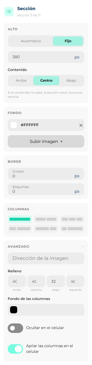
Height
| Setting | What it does |
|---|---|
| Automatic | The section is as tall as its content. This is the normal case. |
| Fixed | The section is as tall as you type, between 20 and 2000 px. When you choose it, the number and Content appear. |
| Content (with fixed height) | Where what is inside sits if there is space left over: Top, Middle or Bottom. For a hero with a heading over a photo, Middle usually looks best. |
If the content does not fit, the section grows. It is never cut off. The fixed height works as a minimum: you will never send an email with a text cut in half.
Background
| Setting | What it does |
|---|---|
| Colour | The section's background, across the full width of the screen (including the sides of the email). The ✕ removes it and the section shows the email's background. |
| Upload image + | A background image for this section only. It is the way to build a hero with text on top: background image + fixed height + heading and button inside. With the image set, you choose Cover, Contain or Repeat (see above). |
Border
| Setting | What it does |
|---|---|
| Thickness | The width of the border line, from 0 to 20 px. With 0 there is no border. When you raise it, Sides, the color and Style appear. |
| Sides | Which sides the line goes on: Top, Right, Bottom, Left. You can turn on several. There is always at least one: to have no border, set the thickness to 0. A line only at the Bottom is an elegant way to separate sections. |
| Colour | The color of the line. It starts at gray #CCCCCC. |
| Style | Solid (one line), Dashed (- - -) or Dotted (· · ·). |
| Corners | Rounds the corners, in px. In the section it works even without a border: it rounds the background. |
Columns
Six buttons with a drawing of each split: One column, Two halves, Three columns, One third and two thirds, Two thirds and one third and A quarter and the rest. The selected one turns green. When you change it, each column keeps its blocks. If you go to fewer columns, nothing is lost: the blocks from the leftover columns move to the end of the last remaining one. If you go to more, the new ones arrive empty.
If you dragged the border between columns on the canvas, no button is marked and below you can read the custom split, for example Custom: 58 % · 42 % (see Change the column widths).
Advanced
| Setting | What it does | Value for a new section |
|---|---|---|
| Image address | The internet address of the background image, if it is already published and you don't want to upload it. | Empty |
| Padding | The space between the edge of the section and its content, side by side. More padding = more breathing room around it. | 10 px on each side |
| Columns background | A color only behind the columns, within the email's width. With Background you paint the whole strip from side to side; with this one, only the email part. Combined: a gray strip from side to side with the content in a white card. | No color |
| Hide on phones | The whole section does not appear when the email is opened on a phone. | Off |
| Stack the columns on phones | On, the columns end up one below the other on a phone. Off, they stay side by side even if they get narrow. Only turn it off with columns of very short content, like three icons or three figures. | On |
The column
To select a column, click an empty spot in the column, outside its blocks. The panel says, for example, Column · column 2 of 2.
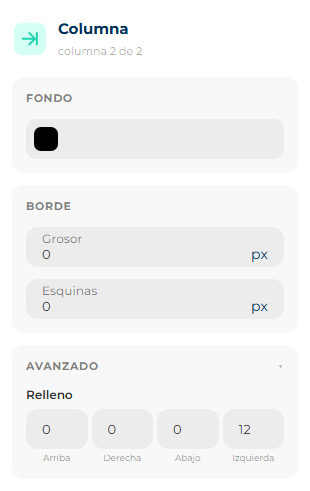
| Setting | What it does |
|---|---|
| Background | A color for this column only. Useful to highlight one of the two halves, for example a colored box with an important fact. |
| Border | The same as the section's: thickness, sides, color, style and corners. A line only on the Right of the first column separates the two columns with a vertical rule. |
| Advanced → Padding | The space between the edge of the column and its blocks. If you give the column a background, raise the padding so the text doesn't sit right against the edge of the color. |
The blocks
Each block has its own settings at the top —the ones that make it what it is— and below them the settings almost all of them share: height, border, spacing and phone. The images in this section show only each block's own part.
Heading
For the email's headings. The text is typed on the canvas with a double-click (see Write and format text). A new heading comes with the placeholder text Título (Spanish for "Heading").
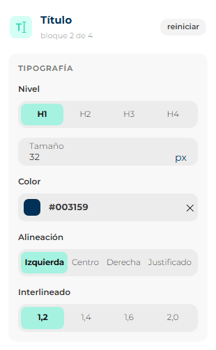
| Setting | What it does | Value for a new heading |
|---|---|---|
| Level | H1, H2, H3 or H4: how important the heading is. H1 is the main heading (one per email); H2, the subheadings; H3 and H4, smaller headings within those. It does not change the size: that is Size. Screen readers use it to understand the order of the email. | H1 |
| Size | The height of the letters, from 8 to 120 px. For reference: 32 px for the main heading, 20–24 px for subheadings. | 32 px |
| Colour | The heading's color. Empty (with the ✕), it takes the email's Text colour, and the field says Inherited from the email. | The email's |
| Alignment | Left, Center, Right or Justified (the lines reach both edges evenly). | Left |
| Line spacing | The space between one line and the next: 1,2 (tight), 1,4, 1,6 or 2,0 (very airy). For headings, 1,2 works well. | 1,2 |
Text
For paragraphs: what the email says. A new text comes with the placeholder Escribe tu texto aquí. (Spanish for "Write your text here."). It is typed on the canvas with a double-click, and right there you add bold, italic, links and variables.
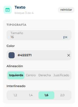
| Setting | What it does | Value for a new text |
|---|---|---|
| Size | From 8 to 120 px. For comfortable reading, between 14 and 16 px. Under 12 px is hard to read on a phone. | 14 px |
| Colour | Same as in the heading: empty, it takes the email's. | The email's |
| Alignment | Left, Center, Right or Justified. For long paragraphs, Left is the easiest to read; center works for texts of one or two lines. | Left |
| Line spacing | 1,2, 1,4, 1,6 or 2,0. For paragraphs, 1,4 or 1,6. | 1,4 |
Image
A photo, a logo, a banner. A new image appears as a box that says Choose an image.
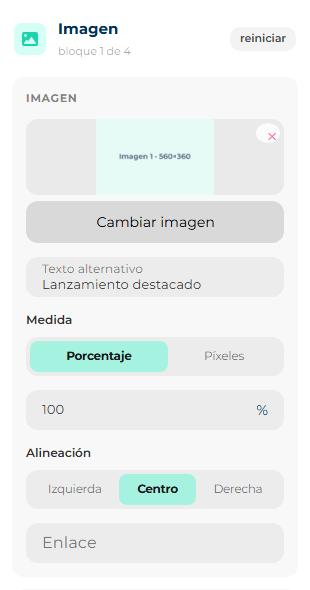
| Setting | What it does | Value for a new image |
|---|---|---|
| Upload image + / Change image | Pick the file from your computer. With an image set you see its thumbnail; the ✕ on the thumbnail removes it. Formats and maximum size: see Images. | No image |
| Alternative text | What is shown instead of the image when the email client blocks it, and what people using a screen reader hear. Always write it. Describe what you see: White pickup truck on a mountain road. | Empty |
| Measure | How the width is measured: Percent (a share of the column: 100% fills it, 50% takes half) or Pixels (a fixed width, from 1 to 1200 px). When you switch from one to the other, the number goes back to 100% or 300 px. Percent is the safest: it adapts to phones on its own. | Percent, 100% |
| Alignment | If the image is narrower than the column: Left, Center or Right. | Center |
| Link | An address so the image can be tapped, like a button. It opens in a new tab. Empty, the image goes nowhere. | Empty |
The image has no Height setting: its height comes from its width alone, so it never gets distorted. It also has no padding to start with (0 on all four sides), so images touch each other without white borders.
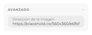
Under Advanced there is Image address: to paste the address of an image already published on the internet instead of uploading it.
Button
The call to action: Book your test drive, See the offer, Write to us. A new button comes with the text Ver más (Spanish for "See more").
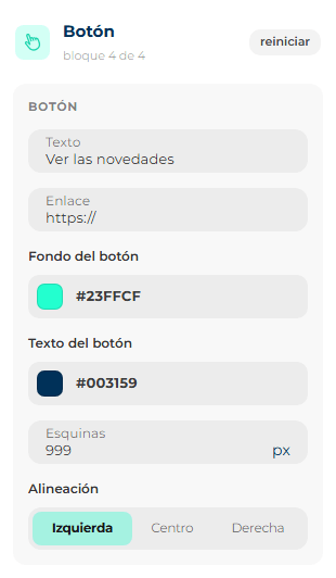
| Setting | What it does | Value for a new button |
|---|---|---|
| Text | What the button says. Plain text only, no formatting. Short and with a verb: Book your appointment works better than Click here. | Ver más |
| Link | Where the button leads. Paste the full address, with https://. A button without a link goes nowhere: always check it. | Empty |
| Button background | The button's color. | Mint #23FFCF |
| Button text | The color of the button's letters. Make it contrast with the background: dark letters on light colors and vice versa. | Black #000000 |
| Corners | How rounded it is, from 0 px (square) to 60 px (a pill). | 12 px |
| Alignment | Left, Center or Right within the column. | Center |
Divider
A horizontal line to separate parts of the email.
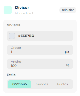
| Setting | What it does | Value for a new divider |
|---|---|---|
| Colour | The color of the line. | Light gray #DDDFE6 |
| Thickness | How thick it is, from 1 to 20 px. | 1 px |
| Width | How much of the column it takes up, from 1 to 100%. A short centered line (30%) looks more delicate than one from side to side. | 100% |
| Style | Solid, Dashed or Dotted. | Solid |
Spacer
An empty gap, to give some breathing room between two blocks. It is not visible in the email: it just pushes down what is below.
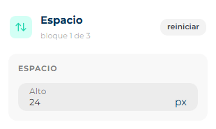
| Setting | What it does | Value for a new spacer |
|---|---|---|
| Height | How much space it leaves, from 1 to 400 px. | 24 px |
The Spacer has no border and no Height group like the other blocks: its height is the block.
Social
Your social media icons, each with the link to your profile. A new block says Add your social links.
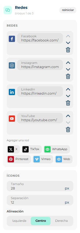
Networks — the block's list of icons:
- Each network has its field with your profile address (for example
https://instagram.com/tumarca). - If a network is left without an address, it warns you: Without a link, this icon is not sent. That icon does not go out in the email.
- To the right of each one: Move up, Move down (the order of the icons) and the trash can to remove it.
- Under Add a network are the ones you haven't used yet: Facebook, Instagram, X, LinkedIn, YouTube, TikTok, WhatsApp, Pinterest, Vimeo and Web (for your website). One click and it joins the list.
Icons — how they look:
| Setting | What it does | Value for a new block |
|---|---|---|
| Size | The size of each icon, from 16 to 64 px. | 32 px |
| Spacing | The space between one icon and the next, from 0 to 48 px. | 12 px |
| Alignment | Left, Center or Right. | Center |
For WhatsApp, the address is https://wa.me/ followed by your number with the country code and without spaces or symbols: https://wa.me/573001234567.
Menu
A row of text links, like a website menu: Home · Catalog · Locations · Contact. It works well at the top, below the logo, or in the footer. A new block says Add the menu links.
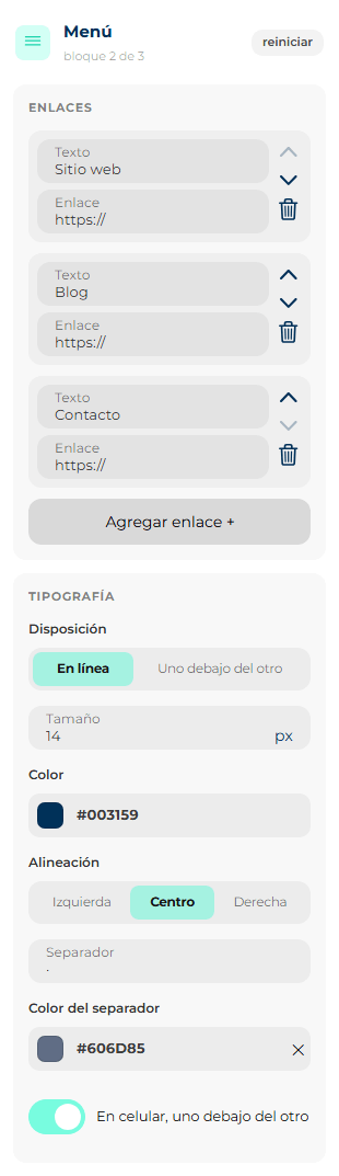
Links — each menu link has Text (what is read) and Link (where it leads), with its buttons to move up, move down and delete. Add link + adds a new one at the end.
Typography:
| Setting | What it does | Value for a new menu |
|---|---|---|
| Layout | Inline (side by side) or Stacked (one below the other). | Inline |
| Size | The size of the letters, from 8 to 40 px. | 14 px |
| Colour | The color of the menu links. | Gray #606D85 |
| Alignment | Left, Center or Right. | Center |
| Separator (inline only) | The symbol that goes between one link and the next: ` | , ·, /`… Leave empty for none. |
| Separator color (only if there is a separator) | Its color. Empty, it takes the menu's color. | The menu's |
| Stack on mobile (inline only) | On a phone the links stack, so they don't end up cramped. | On |
HTML
A code block: to paste something handmade that the editor doesn't have, like a countdown or a very special format. What you paste is sent as is.
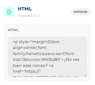
- Type or paste the code in the box.
- If the block came from an old template that could not be converted, at the top it says This came from a template that could not be converted. It is kept as it was and cannot be edited block by block., and it may be locked for typing.
Only if you know what you are doing
One mistake in the code can throw off the whole email, and the editor cannot check it for you. Never paste scripts (email clients delete them and mark the email as suspicious) or external style sheets (they never arrive). If you don't know HTML, you don't need it: everything else is done with blocks.
Columns
It is not a block, even though it is in the palette: it adds a new two-halves section. Its settings are the section's.
Settings shared by the blocks
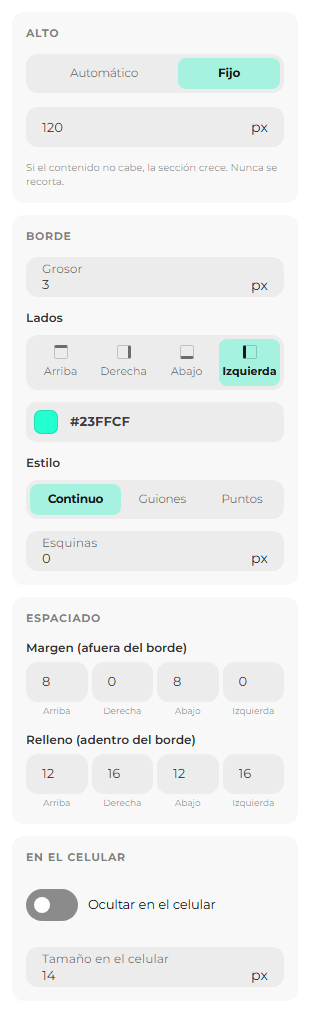
Below their own settings, almost all blocks have these four groups. In the image, a text with a fixed height and a border line on the left:
Height
Automatic (the block is as tall as its content) or Fixed, from 20 to 2000 px. Same as in the section, if the content does not fit, it grows: it is never cut off. It is useful to make two blocks in neighboring columns the same height, for example two product cards with texts of different lengths.
It is not available on the Image (its height comes from its width) or on the Spacer (its height is the block).
Border
The same control as in the section: Thickness (0 to 20 px; 0 is no border), Sides, color, Style and Corners. On a block, the corners only show if there is a border.
A thick colored line only on the Left turns a text into a highlighted quote, like the one in the image.
It is not available on the Spacer or on HTML.
Spacing
The breathing room around the block, in the four boxes Top, Right, Bottom and Left.
- Without a border, there is a single set of boxes: the space between the block and what surrounds it.
- With a border, it splits in two, because now there is an inside and an outside:
- Margin (outside the border): the space between the border and the other blocks.
- Padding (inside the border): the space between the border and the content.
Think of it as a framed picture on a wall: the margin is the wall left around the frame; the padding, the white mat between the frame and the photo.
New blocks come with 10 px on each side, except the Image and the Spacer, which come with 0.
On a phone
| Setting | What it does |
|---|---|
| Hide on phones | The block does not appear when the email is opened on a phone. It is still visible on a computer. |
| Size on phones (only Heading and Text) | A different font size just for phones. For example, a 40 px heading on a computer can be 28 px on a phone so it doesn't take up half the screen. |
To check how it looks, use Phone in the top bar or the preview.