Email templates
An email template is a ready-made email you save to use in your Outbound email campaigns. You build it once —with your logo, your colors, your copy and your buttons— and then pick it every time you create a campaign.
They are created under Settings → Outbound Templates, with a visual editor: you build the email by dragging pieces around, like building blocks, and you see it exactly as the person will receive it. No design or coding knowledge needed.
If this is your first time
Read this page from top to bottom: it takes you from the empty screen to the saved email. When you want to know what a specific setting does (a color, a border, some spacing), it is all in Email editor settings.
Not the same as a WhatsApp template
Email templates are not approved by anyone: you save them and they are ready to use. WhatsApp templates do need Meta's approval and are created in another section (see Templates).
Four words before you start
The editor builds the email like a house: the email is the house, the sections are the floors, the columns are the rooms on each floor and the blocks are the furniture you put in each room.
| Word | What it is | Example |
|---|---|---|
| The whole email, top to bottom. It has settings that apply to everything: the width, the background, the font. | The welcome email for a lead. | |
| Section | A horizontal strip of the email. Sections stack one below the other. | The logo strip, the main photo strip, the footer. |
| Column | Each part a section is split into, from left to right. A section has 1 to 3 columns. | A section with two columns: one product on the left and another on the right. |
| Block | A piece of content inside a column. | A heading, a text, an image, a button. |
There is a fifth one you will see a lot: a variable is a piece of data that changes in each email, like the person's name. You type "Hi" + the Name variable, and Ana gets "Hi Ana" while Pedro gets "Hi Pedro". It is explained in Variables.
Create a template, step by step
- Go to Settings and, in the menu, look for Outbound Templates (it is in the Outbound group). You can also get there from Outbound with Manage Templates → Email Templates.
- Click Create template.
- Fill in the Details: the name, the channel (Email), the subject and, if you want, a description. Further down we explain each field.
- Choose the Starting point: blank, a copy of one of your templates or a generic template. See Where to start.
- Build the email in the editor, in the Content block. That is the rest of this page.
- Check the preview on desktop and on a phone.
- Click Save, in the bar at the bottom. Template created successfully appears and you go back to the list.
The template details
| Field | What it is for |
|---|---|
| Template name (required) | The name you will find it by in the list and when creating a campaign. The customer does not see it. Give it something that says what it is for: Lead welcome, May promo. |
| Channel | Email or SMS. If you switch to SMS, you move to the SMS template form and the name and description you already typed come with you. A template that is already saved cannot change channel. |
| Email subject (required) | The line the person sees in their inbox before opening the email. It is what decides whether they open it, so it is worth thinking about: short, concrete and without SHOUTING IN CAPITALS. |
| Description (optional) | A note for your team: what it is used for, in which campaign. It appears in the template list. |
The subject and the preview text go together
In the inbox, next to the subject, there is one more line: the preview text. You write it inside the editor, in the email settings (see The email). If you leave it empty, the inbox shows the first thing it finds in the email, which is sometimes "Your logo" or a text that says nothing.
Where to start
When you create a template, the Starting point block offers you three paths. You can change everything later: whatever you choose, the email stays editable.
| Option | What it does | When it makes sense |
|---|---|---|
| Blank | Start from scratch. | When you already know the design, or want something very simple. |
| Existing template | Copy one of your templates: opens a menu with your email templates and loads the one you choose as the starting point. The original is left untouched. | To make a variant of an email that already works (the same promo with another product, for example). If you do not have any yet, it says You don't have email templates yet. |
| Generic template | Image, title, text and button: opens a menu with ready-made designs —among them Newsletter Keybe, Newsletter Rosa and Newsletter Natural— and loads the one you choose. | Almost always. It is the fastest way to get an email that looks good: you change the copy, colors and images and you are done. |
If the editor is empty, the question How do you want to start? also appears in the middle, with the same ideas as cards:
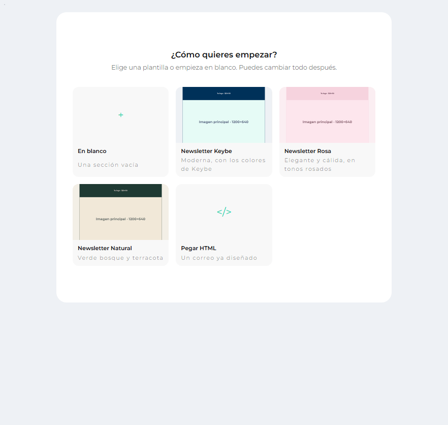
- Blank: One empty section to start dropping blocks into.
- The templates (with their thumbnail): one click and the whole design loads.
- Paste HTML: An email already designed, for example one an agency sent you. Paste the code and click Use this HTML.
Pasted HTML cannot be edited piece by piece
It can be viewed and sent, but not edited block by block. The email comes in as a single piece: you cannot change a color or a text from the editor. If you will need to change it often, it is better to rebuild it with blocks.
The gray images in the templates tell you what to upload
In the generic templates, the images are rectangles that say, for example, Imagen principal · 1200×640 (Spanish for "Main image"). That is the recommended size: if you upload an image with those measurements (or the same shape), it will fit perfectly.
Get to know the screen
The editor has four areas. It is worth finding them before you touch anything:
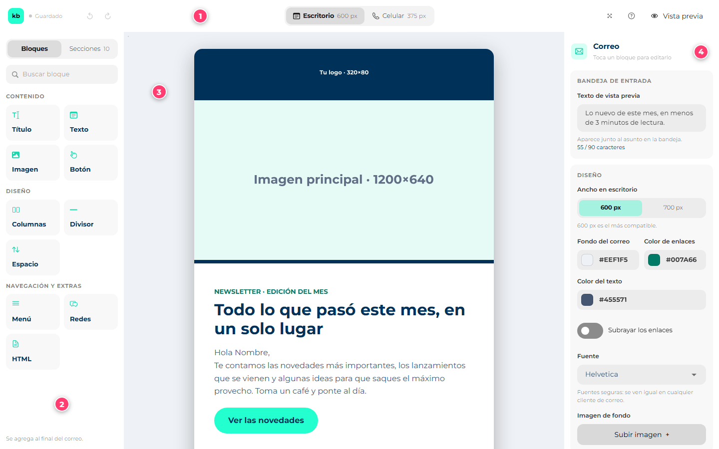
- The top bar: undo, view on desktop or on a phone, full screen, help and preview.
- The palette (left): the pieces you can add to the email.
- The canvas (center): your email, as it will look. This is where you click on things to select them.
- The settings panel (right): the settings of whatever you have selected.
The golden rule of the editor
Click something on the canvas and the right panel shows its settings. A click on a heading shows the heading settings; a click on the edge of a section, the section's. To go back to the settings of the whole email, click the gray background, outside the email. The panel is never empty: if nothing is selected, it shows the email.
The top bar

| # | What it is | What it does |
|---|---|---|
| 1 | Saved / Unsaved | Tells you whether the content has changes. Careful: it does not save on its own. Saving is the Save button in the bar at the bottom of the screen. |
| 2 | Undo and redo (the curved arrows) | Undo reverts the last change; redo applies it again. If you deleted something by mistake, this brings it back. |
| 3 | Desktop / Phone | Changes how you see the email on the canvas: at the width of a computer (600 or 700 px) or of a phone (375 px). See How it looks on a phone. |
| 4 | Full screen | The editor takes up the whole screen, without the rest of the platform around it. You exit with the same button or with the Esc key. Very handy on small screens. |
| 5 | What is this? | A short help with the basic ideas of the editor. |
| 6 | Preview | Opens the real email, as it reaches the person. See The preview. |
The palette
The palette has two tabs at the top: Blocks and Sections (the number next to Sections is how many your email has). Below, Search blocks filters by name.
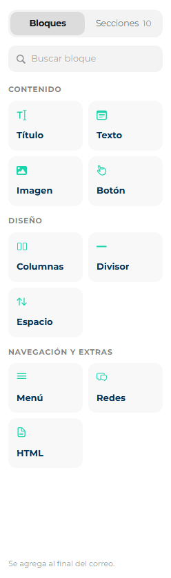
The blocks come in three groups, according to what they are for:
| Group | Blocks | What for |
|---|---|---|
| Content | Heading, Text, Image, Button | What the person reads and where they click. They are 90% of any email. |
| Layout | Columns, Divider, Spacer | What organizes the email: splitting into columns, a separator line, breathing room between pieces. |
| Navigation & extras | Menu, Social, HTML | Menu links, social media icons and your own code. |
What each one is and how to set it up is in The blocks.
The Sections tab holds the Layouts: empty sections already split into columns. Each card draws what the split looks like.
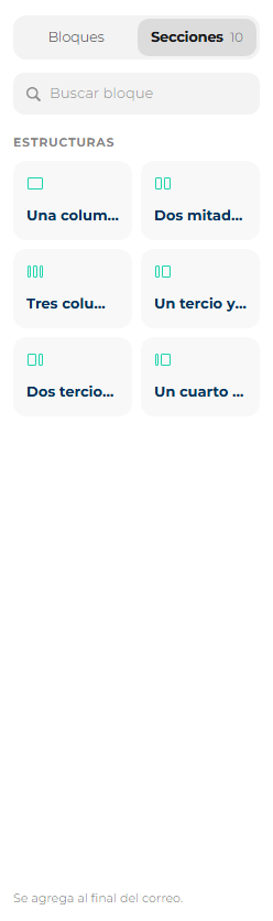
| Layout | What it looks like |
|---|---|
| One column | The full width for a single column. The most common one. |
| Two halves | Two equal columns. Ideal for two products side by side. |
| Three columns | Three equal columns. For three short facts or three icons. |
| One third and two thirds | Narrow on the left, wide on the right. Typical for photo + text. |
| Two thirds and one third | The other way around: wide on the left, narrow on the right. |
| A quarter and the rest | A tiny column (an icon, a small photo) and the rest for text. |
At the bottom of the palette, a sentence tells you where whatever you add with a click will land: Added at the end of the email., Added to the selected section. or Added at the end of the selected column. It depends on what you have selected on the canvas (see Add blocks).
Build the email
Add sections
You have three ways:
- The "+ Section" button below the email, on the canvas: adds a one-column section at the end.
- The Sections tab of the palette: drag a layout to the exact spot in the email where you want it (a line shows where it will land), or click it to add it at the end.
- The Columns block of the palette: even though it sits among the blocks, it actually adds a two-halves section. It is there because that is where people look for it.
Add blocks
Also two ways, and both work just as well:
- Drag: take a block from the palette and drop it where you want it in the email. While you drag, a line shows you where it will end up.
- Click: the block lands on its own, depending on what you have selected.
| If you have selected… | The new block lands… |
|---|---|
| Nothing (or the email) | In the first column of the last section. |
| A section | In the first column of that section. |
| A column or a block | At the end of that column. |
An empty column says Drag a block or an image here: that is the place to drop.
One click selects, two clicks edit
On the canvas, one click on a block selects it (it gets a green border and its name on top). Two clicks on a heading or a text let you type. That way you can select a text to change its color without the typing mode opening.
Move, duplicate and delete
When you select a section, a header appears above it: its number, its height and its buttons.
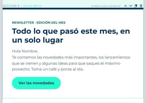
When you select a block, the same happens on a smaller scale: its name on the left and its buttons on the right.
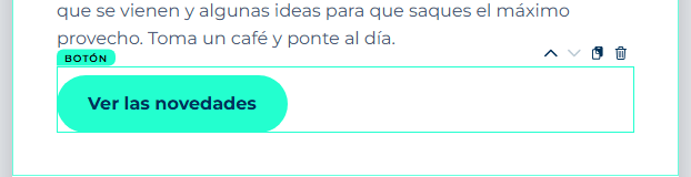
| Button | What it does |
|---|---|
| ⌃ Move up | Swaps it with the one above. Disabled if it is already the first. |
| ⌄ Move down | Swaps it with the one below. Disabled if it is already the last. |
| Duplicate (two little sheets) | Creates an exact copy right below. It is the fastest way to make "another one just like it but with different text". |
| Delete (trash can) | Deletes it. It does not ask for confirmation: if you make a mistake, use Undo in the top bar. Deleting a section deletes everything inside it. |
To move something further, drag it: a section is dragged from drag to reorder in its header; a block is dragged by grabbing it directly, even to another column or another section.
Locked sections and blocks
Some elements can come locked: you can see them, but they do not show the buttons to move or delete them. This happens mostly with content that came from an old template and could not be converted.
Change the column widths
The palette layouts come with fixed splits, but you can adjust them by hand: select the section and drag the line between two columns. While you drag, a label tells you how the split is turning out, in percentages.
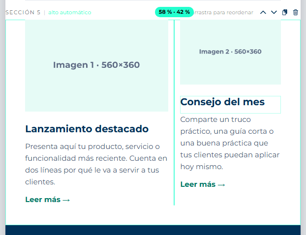
- The width moves in steps (each step is one twelfth of the width, roughly 8%). A column cannot get narrower than about two twelfths (17%).
- If you prefer the keyboard: click the line and use the ← and → arrows.
- To go back to a standard split, pick one under Columns, in the section panel. If the split is custom, the panel says so: Custom: 58 % · 42 %.
Set a fixed section height
By default, each section is as tall as its content. If you want a section to always measure exactly the same —for example, a hero with a 380 px background image—, select the section and in the panel set Height to Fixed and type the measurement. With Content you decide whether what is inside goes at the top, in the middle or at the bottom.
A fixed height never cuts the content
If the content does not fit, the section grows. It is never cut off. When that happens, the canvas warns you with The content does not fit: the section grows when sent. If you see that warning, shrink the text or raise the height.
All the details are in The section.
Write and format text
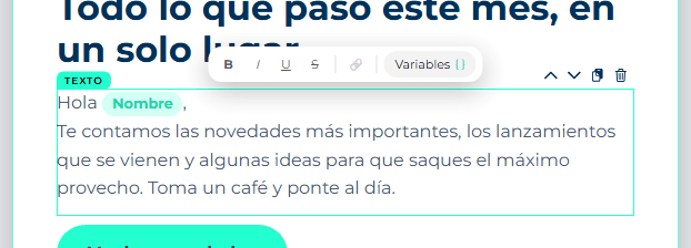
Double-click a Heading or Text block and start typing. A small formatting bar appears above the block:
| Button | What it does |
|---|---|
| B | Bold. |
| I | Italic. |
| U | Underline. Use it sparingly: in an email, underlined text looks like a link. |
| S | |
| 🔗 Link | Turns what you selected into a link. It asks you Where does this link go?: paste the full address, with https://. |
| Variables { } | Inserts a piece of the person's data, like their name. See below. |
First select the words and then click the format. To finish typing, click outside the block.
The size, color, alignment and line spacing are not in the small bar: they belong to the whole block and are changed in the right panel (see Text).
Heading or Text?
Use Heading for headings and Text for everything else. They look different, but on top of that the heading tells screen readers (and some email clients) that it is a heading.
Variables: an email with each person's name
A variable is a blank that gets filled with each contact's data at the moment of sending. You type "Hi Name" just once, and each person receives their own.
- Double-click a text to type and place the cursor where the data goes.
- Click Variables { } in the small bar.
- Search for the data (for example, name) or browse the groups, and click it. You can also move with ↑ ↓, insert with Enter and close with Esc.
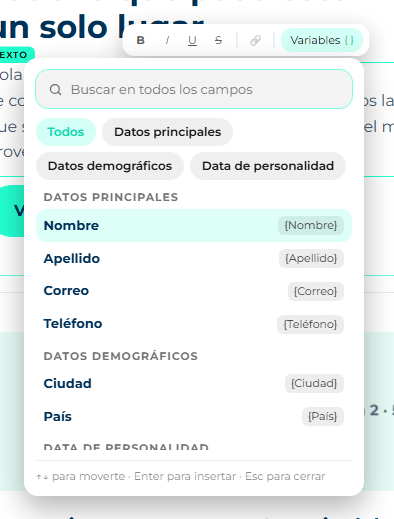
- At the top there is a search box (Search all fields) and the groups: All, Principal data, Demographic data, Personality data, Habeas data and your industry's own fields. They come from your contacts' fields in the CDP.
- What you used last appears under Recent, so you don't have to search for it again.
- In the text, the variable shows as a green tag with the name of the data. It is deleted all at once, not letter by letter: that way you never end up with half a variable.
Another way: Select field
Above the editor, next to Content, the Select field button opens the same list, but instead of inserting the variable it copies it to the clipboard (Copied to clipboard appears). Then you paste it into the text with Ctrl + V. It is the same as the Variables button, by another route.
Use data your contacts have
A variable can only be filled if the contact has that data loaded. Before using City or an uncommon field, check in the CDP that your contacts have it filled in. The name is usually the safest bet.
Images
There are three ways to add an image:
- With the Image block: add it and, in the right panel, click Upload image + and pick the file from your computer.
- By dragging the file: drag an image from a folder on your computer and drop it directly into a column on the canvas. While it uploads you see Uploading image… and then it becomes an Image block.
- By pasting an address: if the image is already published on the internet, paste its address in Advanced → Image address, in the image panel.
What you need to know about the files:
| Formats | JPG, PNG, GIF, WebP and SVG. For emails, the safest are JPG (photos) and PNG (logos, graphics): some email clients, like Gmail, do not show SVG. |
| Maximum size | 5 MB per image. If it is bigger: The image is larger than 5 MB. Shrink it before uploading. |
| Dimensions | The email is 600 or 700 px wide. An image at double that width (1200 px) looks sharp on high-resolution screens. Bigger does not look better, it just weighs more. |
Always write the alternative text
Many email clients block images until the person says "show images". In the meantime, instead of the image, its alternative text is shown. If you leave it empty, nothing shows there. Write what the image shows: Red SUV, 2026 model, Midtown Car logo.
If something goes wrong while uploading, the editor tells you what happened:
| Message | What to do |
|---|---|
| That kind of file cannot be used as an image | The file is not JPG, PNG, GIF, WebP or SVG. Save it in one of those formats. |
| The image is larger than 5 MB / The service turned the image down for its size | Use a lighter version. |
| Your session is not allowed to upload images. Sign in again. | Your session expired. Save what you have, sign out and sign in again. |
| We could not upload the image: check your connection | Check your internet and try again. |
| We could not upload the image. Try again. | The service failed. Wait a moment and try again; if it keeps happening, paste the address of an image that is already published. |
How it looks on a phone
More than half of all emails are opened on a phone. To check it, click Phone in the top bar: the canvas narrows to 375 px, the width of a small phone.
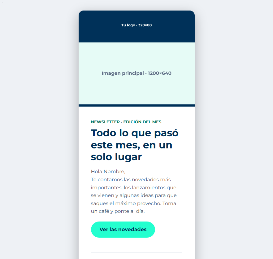
What changes on a phone:
- The columns stack: what sits side by side on a computer ends up one below the other on a phone. If you don't want that in a section, it can be turned off (see The section, Stack the columns on phones).
- You can hide things on phones only: almost everything has the Hide on phones switch. It is useful, for example, for a decorative image that just gets in the way on a small screen.
- Texts can have a different size: a 40 px heading can be huge on a phone. Size on phones adjusts it just for there.
Whatever you change in Phone mode is saved just like in Desktop: it is the same email, only the way you look at it changes.
The preview
The canvas is for editing: it looks a lot like the final email, but it is not exactly the same. The Preview shows the real email, built the way it reaches the person.
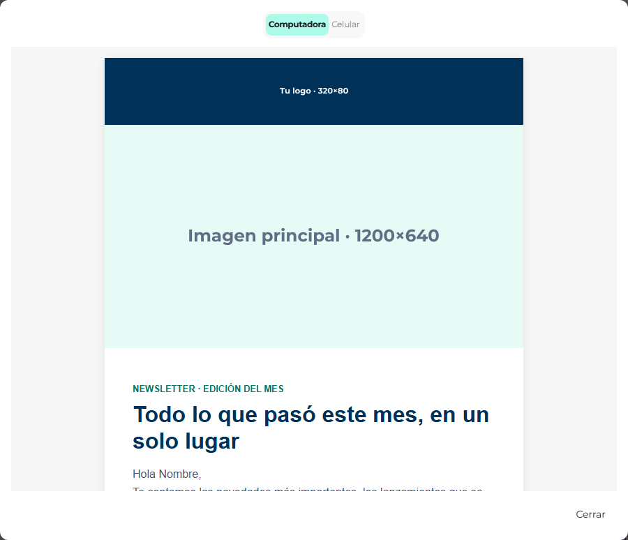
At the top you choose Desktop or Phone. Close it with Close. Always look at it before saving, and especially in Phone.
Save
The editor does not save on its own. The bar at the bottom of the screen tells you where you stand: You have unsaved changes or Everything is saved.
- Click Save. If it works, Template created successfully appears (or Template updated successfully if you were editing) and you go back to the list.
- Save is grayed out if the name or the subject is missing, or if you didn't change anything.
If you close without saving, you lose the changes
The X at the top right closes the template. Whatever you didn't save is lost.
Use the template in a campaign
Go to Outbound → Create new... → Email and pick your template in the Template field. The whole step by step is in Create a campaign.
If the campaign tells you You need to review this template first, it is because the template was never saved from the editor: open it, review it and click Save.
Edit or delete a template
In Settings → Outbound Templates, each template in the list has Edit and Delete. Editing opens the same form, with everything already loaded and without the Starting point (the starting point is what you already saved). The channel cannot be changed.
Templates created with the previous editor
Templates saved before this editor still open in the previous editor, which looks different (dark panels, tools on the right). You can keep using it without any problem.
If you want to move one of those templates to the new editor:
- Create a new template with Create template.
- Under Starting point, choose Existing template and pick the old one.
- The editor converts it. If something did not come out identical, We converted the template. N things did not come out the same. appears above the canvas. Click See details to find out what it was.
- Review those parts, fix what is needed and save. The old template stays intact.
What the conversion details can say:
| Notice | What it means |
|---|---|
| A … element has no equivalent and was kept as an HTML block. | That piece looks the same, but it became an HTML block: it cannot be edited piece by piece. If you need to change it, rebuild it with regular blocks. |
| A … element could not be converted or kept. | That piece was lost. Find it in the old template and rebuild it. |
| A display condition was dropped. | In the previous editor that part was shown only to some people. Now it is shown to everyone. |
| A column split (…) was adjusted to the closest one. | The columns ended up with a very similar width, not an identical one. |
| A phone setting we cannot represent was dropped. | A detail of how it looked on a phone did not make it. Check it in Phone mode. |
| A background video was dropped. | Background videos do not exist in the new editor (besides, almost no email client shows them). |
| A social network we do not know was dropped. | An icon for a network the Social block does not have. |
| The template width (…) was out of range, so 700px was used. | The original width was unusual; it ended up at 700 px. |
Click Got it to close the notice.
Make sure the email gets through
The things that make an email look bad, end up in spam or get clipped. None of them is mandatory, but they all help:
- Don't make the email too heavy. Gmail clips emails over 102 KB and shows View entire message: whatever is below (the footer, the unsubscribe button) almost nobody sees. Lots of sections, lots of pasted HTML or very long texts add weight.
- Alternative text on every image, always (see Images).
- No empty links. A button or a social icon without an address goes nowhere. The Social block does not even send an icon without an address: Without a link, this icon is not sent.
- Background images with a fallback color. Outlook for Windows does not show background images. Also give it a similar background color, so the text can still be read.
- Safe fonts. The editor only offers fonts that look the same in every email client. Don't try others by pasting HTML: the client ignores them.
- Contrast. If the text cannot be read against the background, the editor warns you: With these colours the text cannot be read. Listen to it: the sent email would look just as bad.
- The 600 px width is the most compatible. 700 px works fine, but 600 is the standard every email client shows without shrinking.
- No weird code in HTML blocks. Email clients drop scripts and they also mark the email as suspicious; external style sheets never arrive.
Common problems
The Save button is grayed out. The Template name or the Email subject is missing, or you haven't changed anything yet.
I set a fixed height and the section ended up taller. The content does not fit in that height. The editor never cuts the content: it enlarges the section. Shrink the text or the images, or raise the height.
It won't let me edit a block piece by piece; it says HTML. It is a code block: you pasted it, or it came from an old template that could not be converted (This came from a template that could not be converted. It is kept as it was and cannot be edited block by block.). If you need to change it often, rebuild it with blocks.
My template opens in a different editor. It was saved with the previous editor. See Templates created with the previous editor.
The canvas and the preview don't look exactly the same. That's normal: the canvas is for editing. What counts is the preview.
I deleted something by mistake.Undo, in the top bar (the curved arrow pointing left).
I can't find a block in the palette. Check that you are on the Blocks tab (not Sections) and that the search box is empty. If you search for something that doesn't exist, it says Nothing by that name.
Keep reading
- Email editor settings: what each setting of the email, the section, the column and each block does.
- Create a campaign: use the template in a send.
- SMTP domain: the domain your emails go out from. Without it verified, nothing is sent.